Please Move the Notification Banner Somewhere Else!

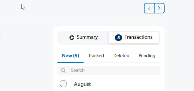
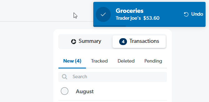
On the computer version of the app, whenever I move a transaction into a budget item, there is a popup confirmation that shows I have successfully moved it into said category.
However, I find it really annoying that this pops up right over the arrow buttons to move forward and backward by a month. Often at the beginning of the month, I have to track transactions that processed late in my bank into the previous month in combination with newer transactions that I've made in the current month. This gets really tedious as I have to wait for the banner to dismiss entirely before I can sift either way.
I would like to simply request that this pop-up banner be moved to anywhere that won't block any clickable action. I feel like that's a very simple UI/UX principle to follow here.
Thanks!
Please sign in to leave a comment.
Comments
0 comments